
Print-Ready Files Explained: DPI, Bleed, Safe Zones and Color Modes

Every print shop knows the moment: an order comes in, you open the customer’s file, and it is 72 DPI, RGB, exactly the size of the design with no bleed. Now someone has to email the customer, explain what bleed is, and wait. “Print-ready” is the difference between files that go straight to the machine and files that go back and forth for days. This guide explains the four things that make a file print-ready (resolution, bleed, safe zones and color mode) in plain language, for anyone preparing files themselves or deciding what their store should demand from customer uploads. It is part of our complete guide to selling personalized products online.
What “print-ready” actually means
A print-ready file can be produced without anyone touching it. Concretely, that means: high enough resolution for the print size (usually 300 DPI), the artwork extended past the cut line (bleed), critical content kept away from the edges (safe zone), the color mode your process expects, and the format your equipment or RIP software accepts. Miss any one of these and a human has to intervene, which is exactly the cost that eats the margin on personalized products.
Resolution: why 300 DPI is the magic number
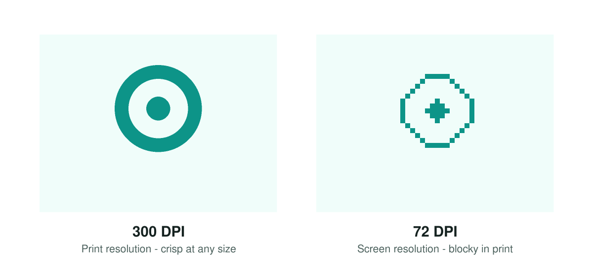
DPI (dots per inch) describes how much image information exists per inch of printed output. Screens get away with 72–150 DPI because they emit light and sit at arm’s length; print reflects light and gets examined up close, so commercial printing standardized on 300 DPI at final size. That last part matters: a 1200×1200 pixel image is 300 DPI when printed at 4×4 inches, but only 100 DPI when stretched to 12×12 inches. Resolution is always relative to print size.
Common settings per application: 300 DPI for standard products (mugs, shirts, cards), 150 DPI for large-format work viewed from a distance (banners, signage), 600 DPI for fine-detail work like small engraving. The practical rule for customer uploads: enforce a minimum pixel size per product at upload time, because no software can invent detail that was never captured.
Bleed, trim and safe zones: the three rectangles
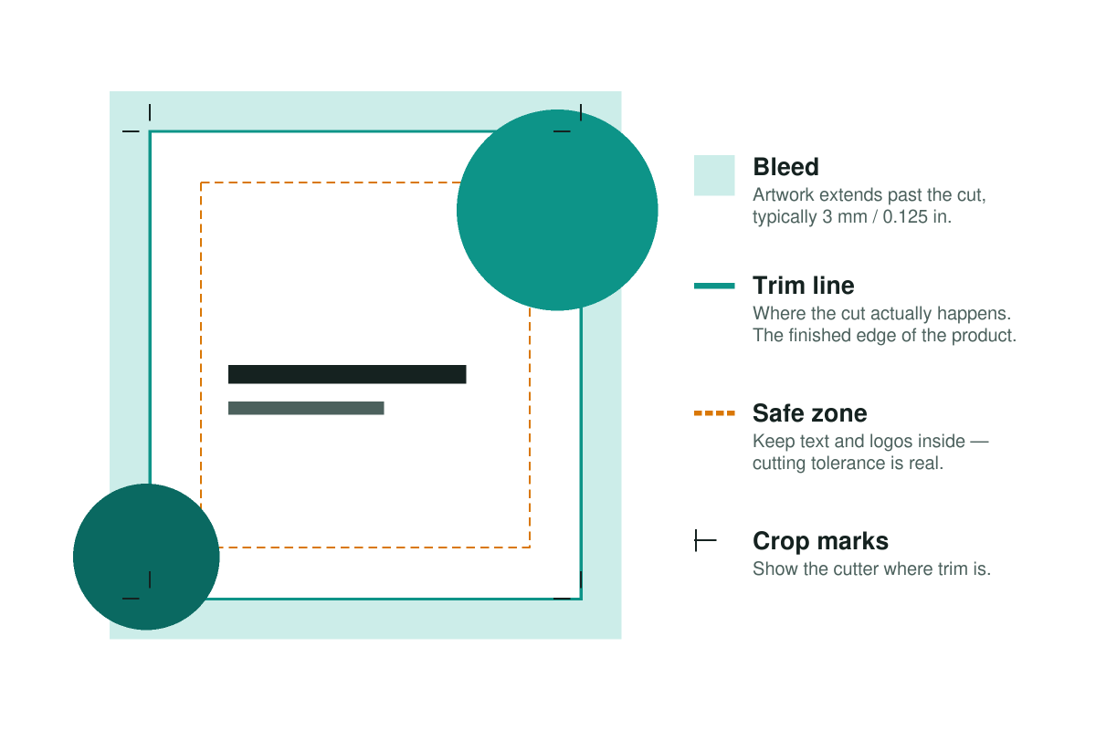
Physical cutting has tolerance: a millimeter or two of drift is normal. The three-rectangle system absorbs that drift:
Bleed is artwork extending past the final edge, typically 3 mm (0.125 in). If a background should reach the edge of the product, it must be drawn past the edge; otherwise a slightly off cut leaves a white sliver.
The trim line is where the cut is supposed to happen: the finished size of the product. Crop marks in the exported file show the cutter exactly where this is.
The safe zone sits inside the trim, again typically 3 mm. Text, logos and anything that must not be clipped stays inside it. A design where the customer’s name touches the edge looks fine on screen and gets amputated in production.
These rules extend beyond paper: garment printing has its equivalent in maximum print areas per size, and engraving has material-specific margins: a laser workflow defines engravable zones exactly the way a printer defines trim.
RGB vs CMYK: why colors shift in print
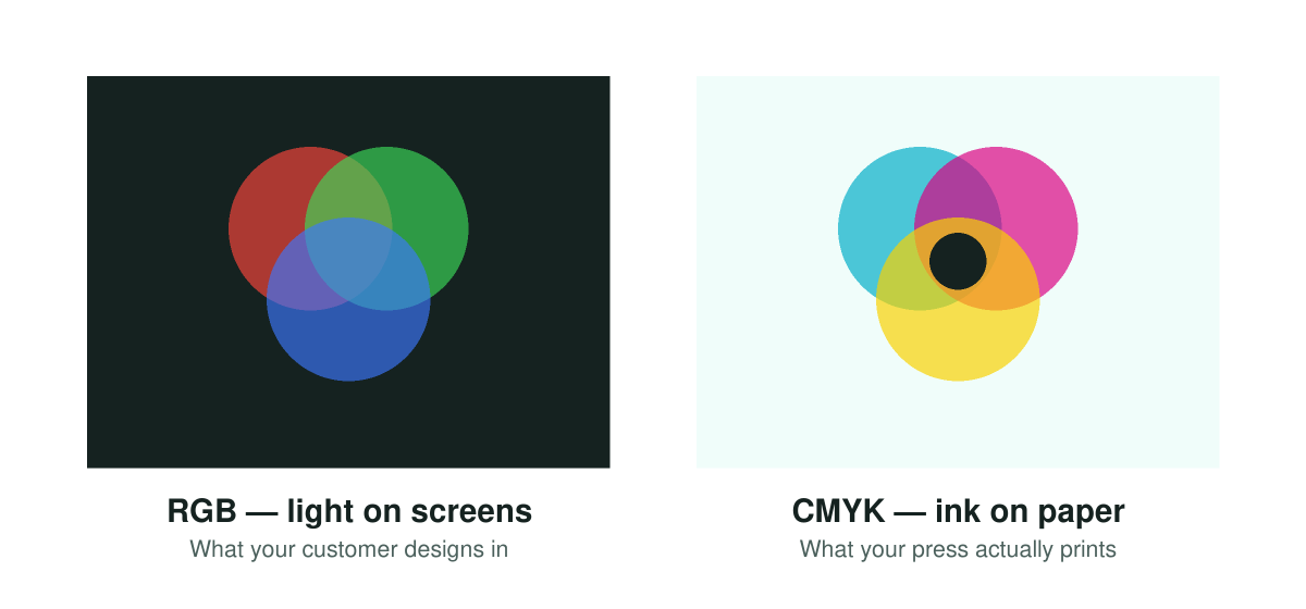
Screens create color by adding light (red, green, blue); presses create it by subtracting light with ink (cyan, magenta, yellow, black). The RGB space is larger: vivid electric blues and neon greens exist on screen that no ink combination can reproduce. That is why a design can look luminous in the editor and slightly muted on the product.
What to do about it depends on your process. Digital methods (DTG, DTF, sublimation, most photo printing) accept sRGB input and handle conversion in the printer driver or RIP, which is the modern default. Offset and some commercial processes want CMYK-converted files with a specific ICC profile. The two practical safeguards: keep brand-critical colors out of the unprintable neon range, and proof one physical sample before putting a new product live. If customers design in your store, show them realistic on-screen color and let your production pipeline do the conversion consistently. Consistency matters more than perfection here.
File formats: what to send to the machine
- PNG — lossless, supports transparency. The standard for DTF/DTG transfers where the design floats on the garment. Raster: resolution rules apply in full.
- JPG — smaller files, no transparency, slight compression loss. Fine for full-coverage photographic products; wrong for anything needing a transparent background.
- PDF — the production workhorse: holds vector and raster content, embeds fonts, carries bleed and crop marks. What most commercial printers and cutters want.
- SVG / vector — infinitely scalable paths. Essential where a machine follows lines: laser cutting, plotting, engraving trace work.
The right format is dictated by the machine at the end of the pipeline, not by preference. Ask your printer or check your RIP’s input spec, then standardize.
The print-ready checklist
- Resolution: 300 DPI at final print size (150 large-format, 600 fine detail)
- Bleed: 3 mm / 0.125 in beyond trim on all edge-touching artwork
- Safe zone: text and logos at least 3 mm inside the trim
- Color: sRGB for digital processes, CMYK with the requested profile for offset
- Format: per your machine, so PNG (transparency), PDF (documents), or vector (cutting/engraving)
- Fonts: outlined or embedded, never assumed to exist on the production machine
Or: never touch a customer file again
Most of the above can be enforced by hand, or it can be enforced at design time, so bad files cannot exist in the first place. That is the structural argument for a product customizer with server-side rendering: the editor constrains customers to your print area and safe zones while they design, and when the order lands, the system renders the file at your configured DPI, with bleed applied, in the format your workflow expects, attached to the WooCommerce order automatically. Stores running a web-to-print setup this way simply do not have a file-checking step.
Want to see what your production files would look like? Book a demo and we’ll configure one of your products end to end.
